(I am an Amazon affiliate and from time to time I will share links for products that I love, or that I think you will find useful. Should you choose to purchase with the provided links, I will receive a small commission at no cost to you.)
According to Wikipedia, ombré, which means “shaded” in French, is the blending of one color to another, typically moving from a lighter color to a darker color. Though most often used in beauty or fashion, the effect is a fun one to incorporate into home decor through our embroidery projects as well.
I love using DMC threads for my ombré projects because they have nearly 500 different colors of six-strand embroidery floss to choose from, making it easy to find a color palette that I’ll like. Plus they are readily available in big box craft stores, as well as many places online.
In order to choose colors that work well in an ombré design, it’s helpful to choose threads from one color family. The trouble is when you walk into most craft stores, the DMC thread displays are organized by number rather than color family. That makes it easy to pick out threads if you already know the numbers you want. But it also means that you can stand in front of the display for ages trying to pick exactly the right hues that will work for your project if you don’t know what threads go together in a family. And as DMC adds more colors to their thread line, it’s hard to know where they fit in with their older colors.
I’m happy to say that there is a much easier way to choose your colors for ombré stitching!
Using a DMC Color Card
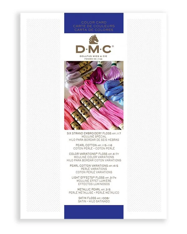
One of my favorite tools that I’ve picked up over the years is the DMC Color Card. You can get either a printed color card, or a card that features the actual dyed threads for each DMC color. And one of the wonderful things about the DMC Color Cards is that they organize the threads by color family rather than by number.
I found this method of organization so helpful that I used my DMC Color Card as a template for how to organize my embroidery floss in its bins. This approach allows me to see all the hues DMC has created grouped together so that I can view all of the tints and shades of a certain color in one place. Plus I can easily identify if I need a slightly warmer or cooler shade for a particular project.
Choosing an Ombré Color Palette
Because of how they are organized, DMC Color Cards are also perfect for helping you to choose a family of colors that will go together in an ombré project.
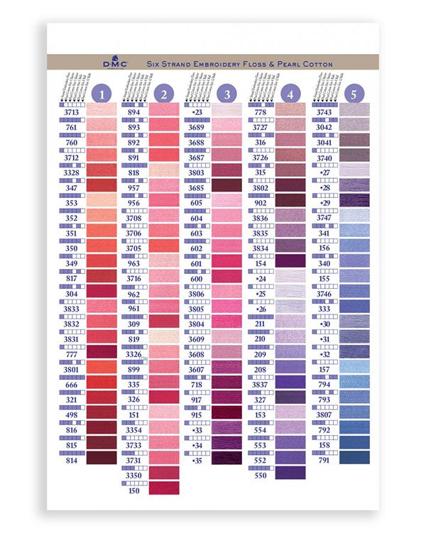
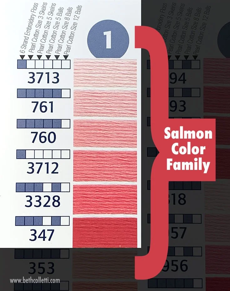
If you look at the inside of a card, you’ll notice the panel is organized from light to dark for each color family, making it easy to select a group of them for a project. The numbers for each color are found next to the swatches, and there is also a key that communicates what type of threads (six strand, pearl cotton, etc.) the colors are found in.
In the first column, for example, you’ll see the first color family includes DMC 3713, 761, 760, 3712, 3328 and 347. This is the Salmon family starting with 3713, Very Light Salmon, all the way to 347, Very Dark Salmon.
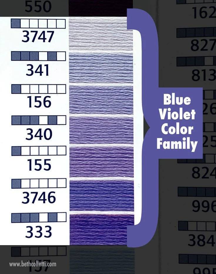
A few columns over the color families start to shift from pinks and reds to purples. Another family includes:
DMC 3747 (Very Light Blue Violet)
DMC 341 (Light Blue Violet)
DMC 156 (Medium Light Blue Violet)
DMC 340 (Medium Blue Violet)
DMC 155 (Medium Dark Blue Violet)
DMC 3746 (Dark Blue Violet)
DMC 333 (Very Dark Blue Violet)
While you don’t have to use every color in a family to create an ombré effect, you can see how using a DMC Color Card really takes the guesswork out of this type of color selection. Even if you eliminate a few of the tints or shades in a color family, you can be sure that all of the colors will transition nicely from one to another in a design that uses ombré.
